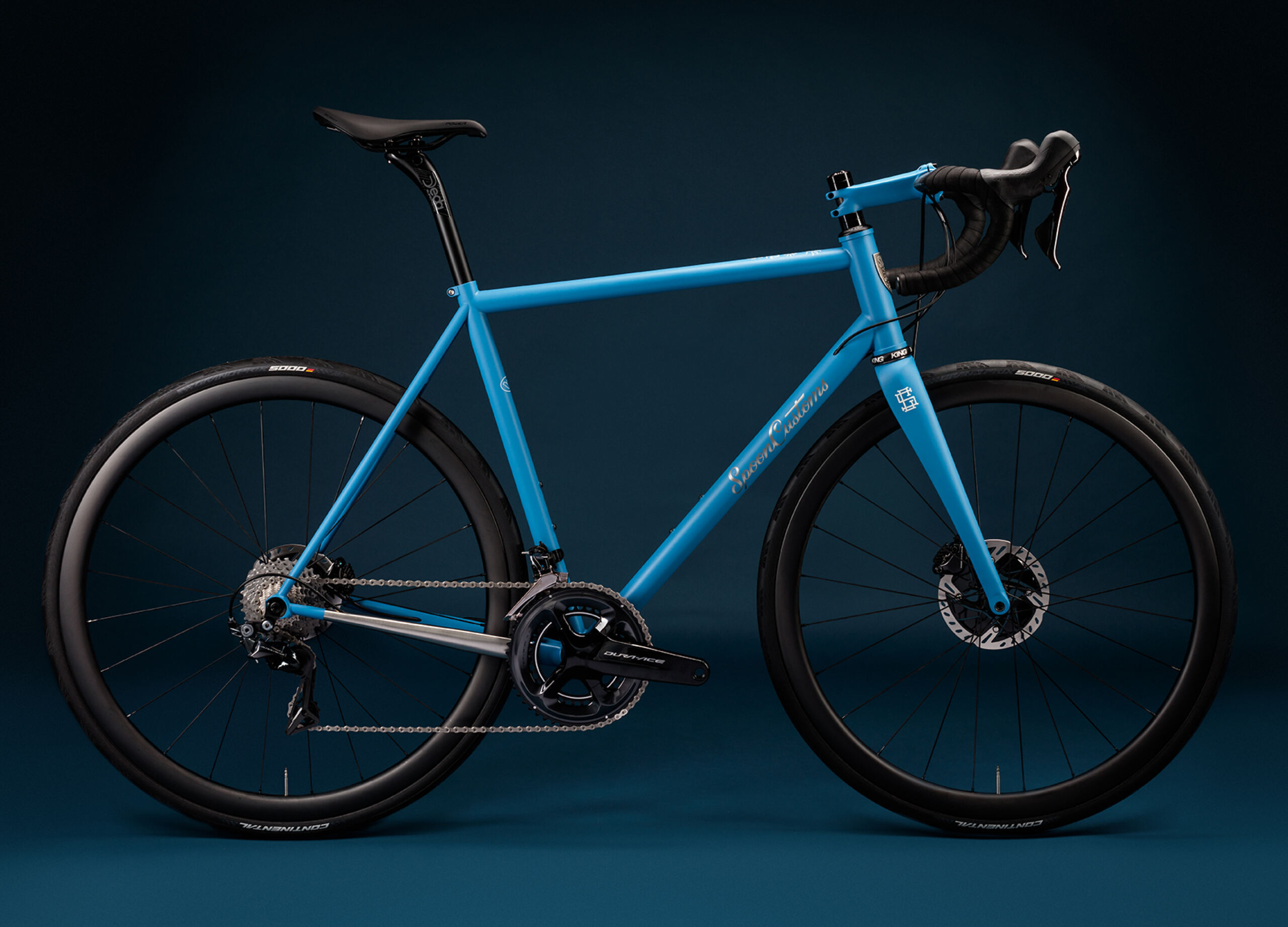
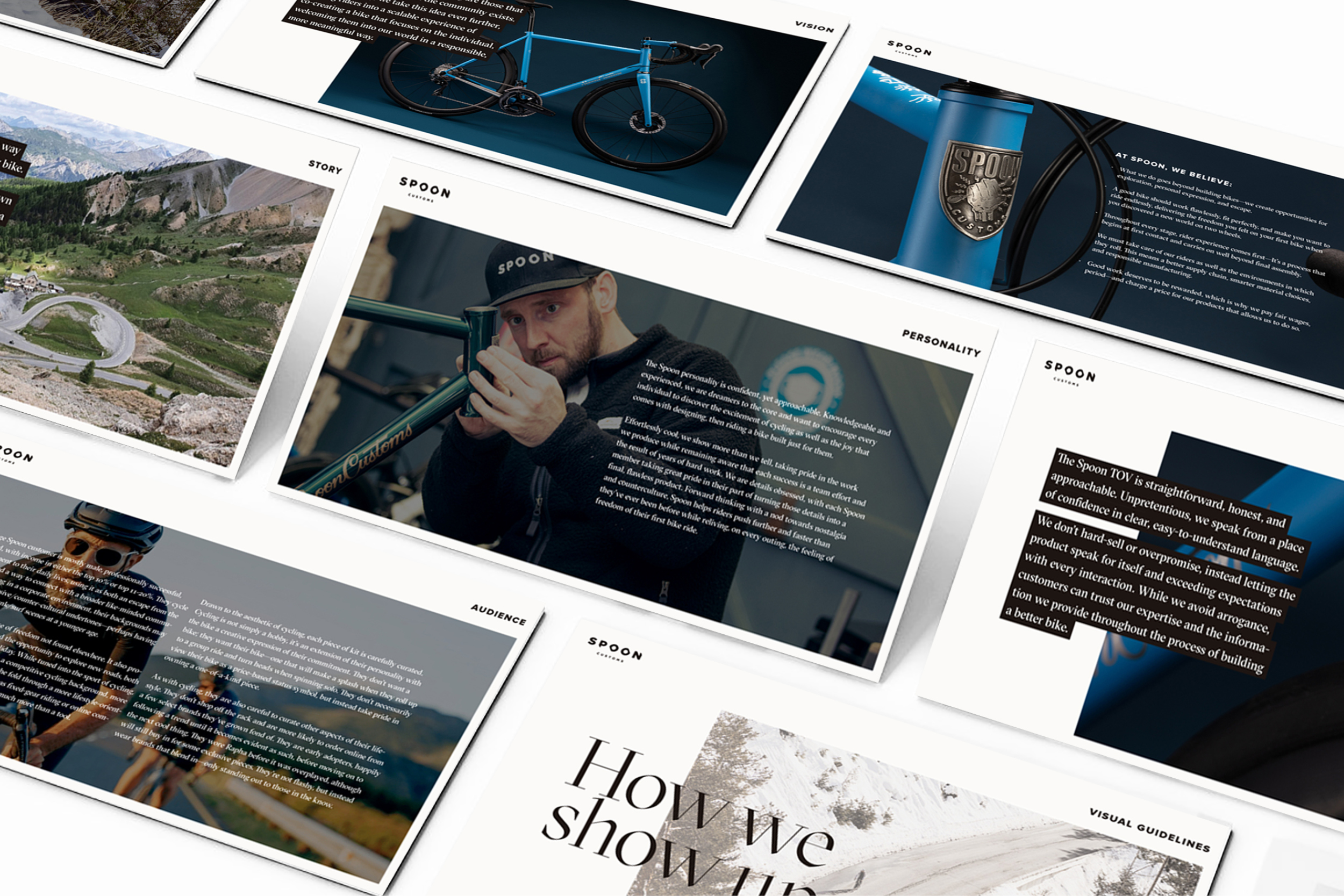
In 2022 we worked on a visual identity for Spoon Customs, a bespoke, handmade bike company. The brief? To rationalise their visual identity and develop a clear set of guidelines around the brand.
The brand is the brainchild of Andy Carr, a man who threw in a lucrative career in the city to follow his dream to the Alps where he learnt the craft of bespoke bike building. The visual identity had originally been inspired by the hand brushed sign-writer’s graphics found in the world of the custom shop. The brand had morphed into a schizophrenic beast with many different personalities and it was our job to shake the whole thing down and give it one clear focussed direction without loosing it’s original charm.
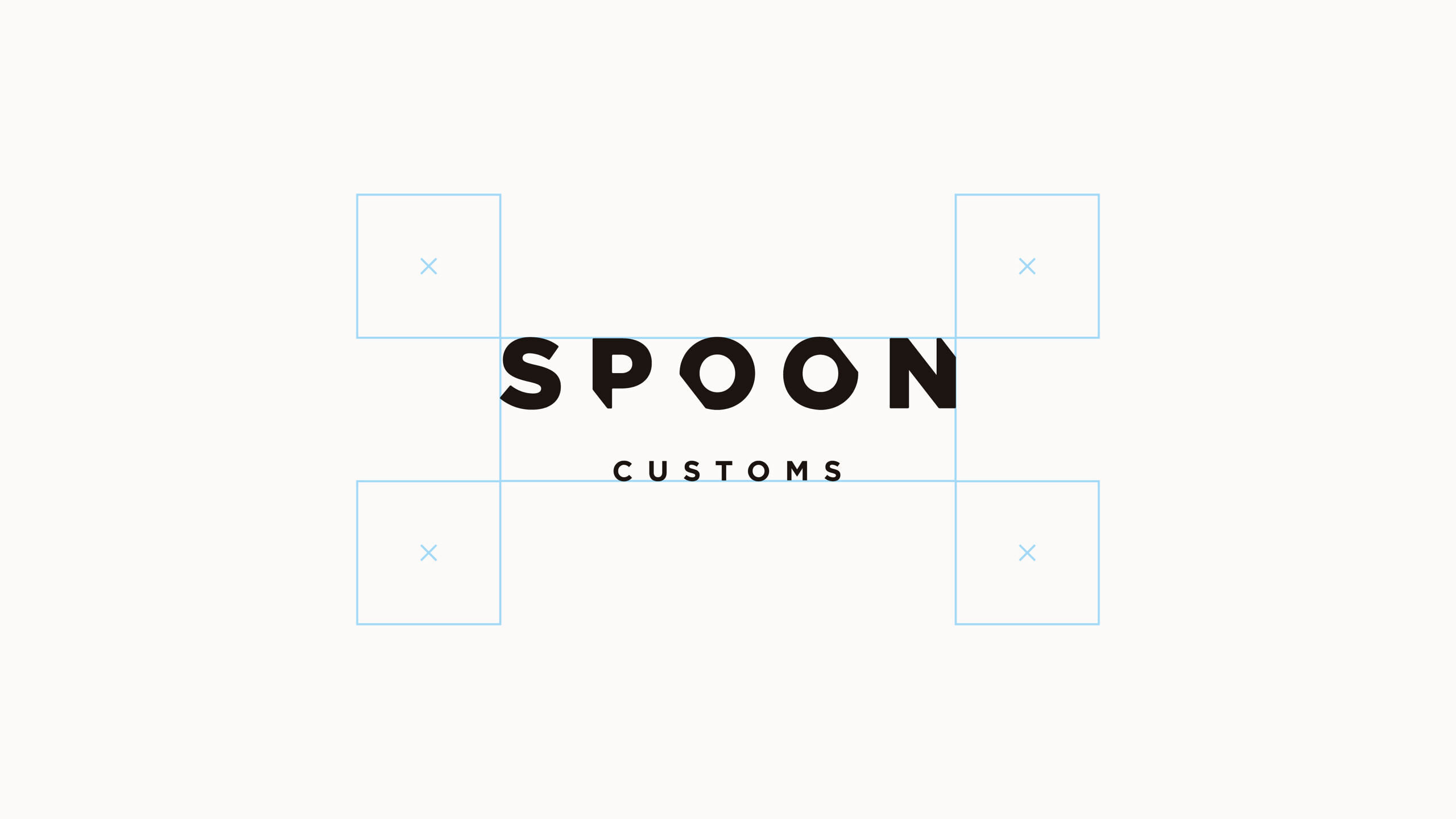
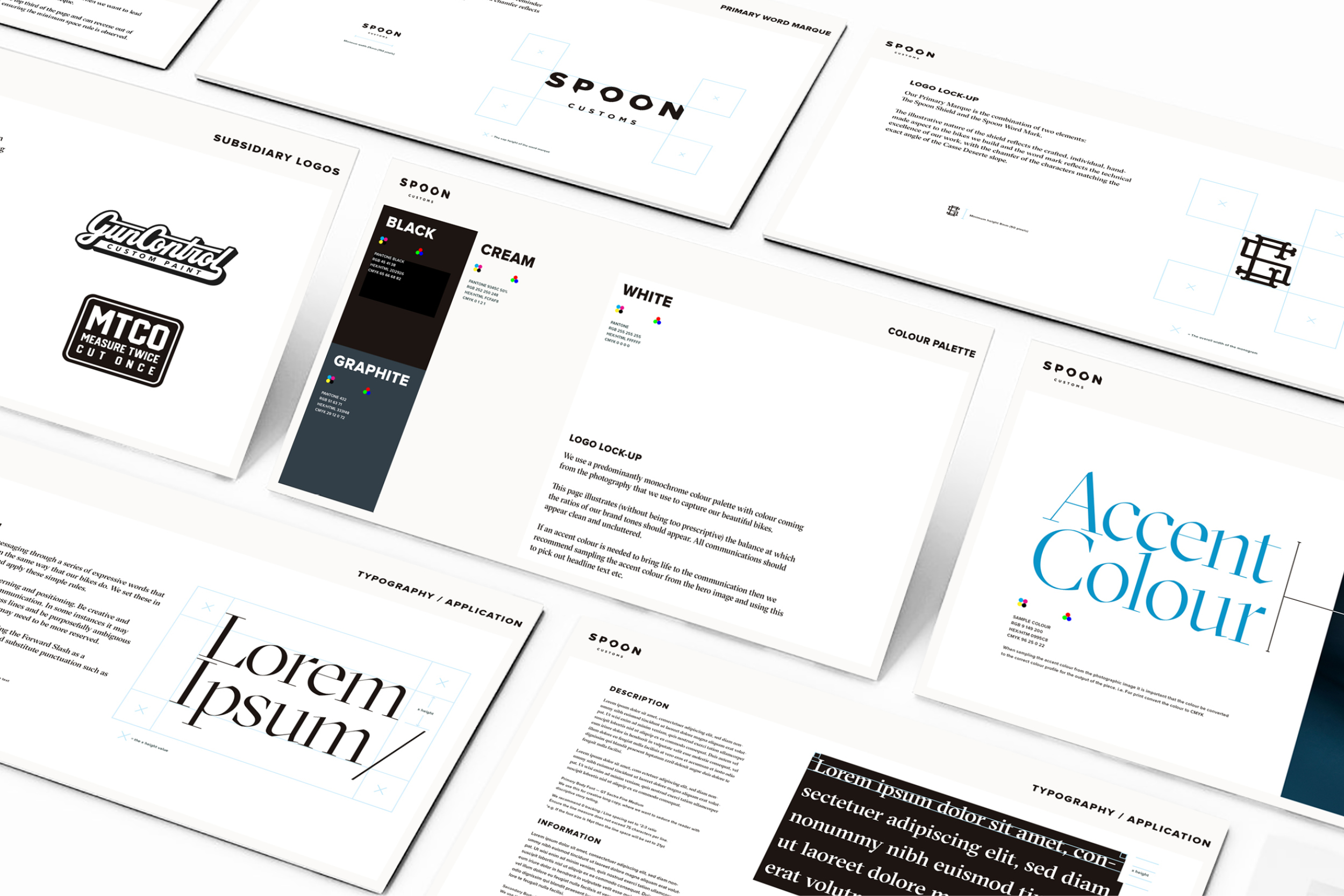
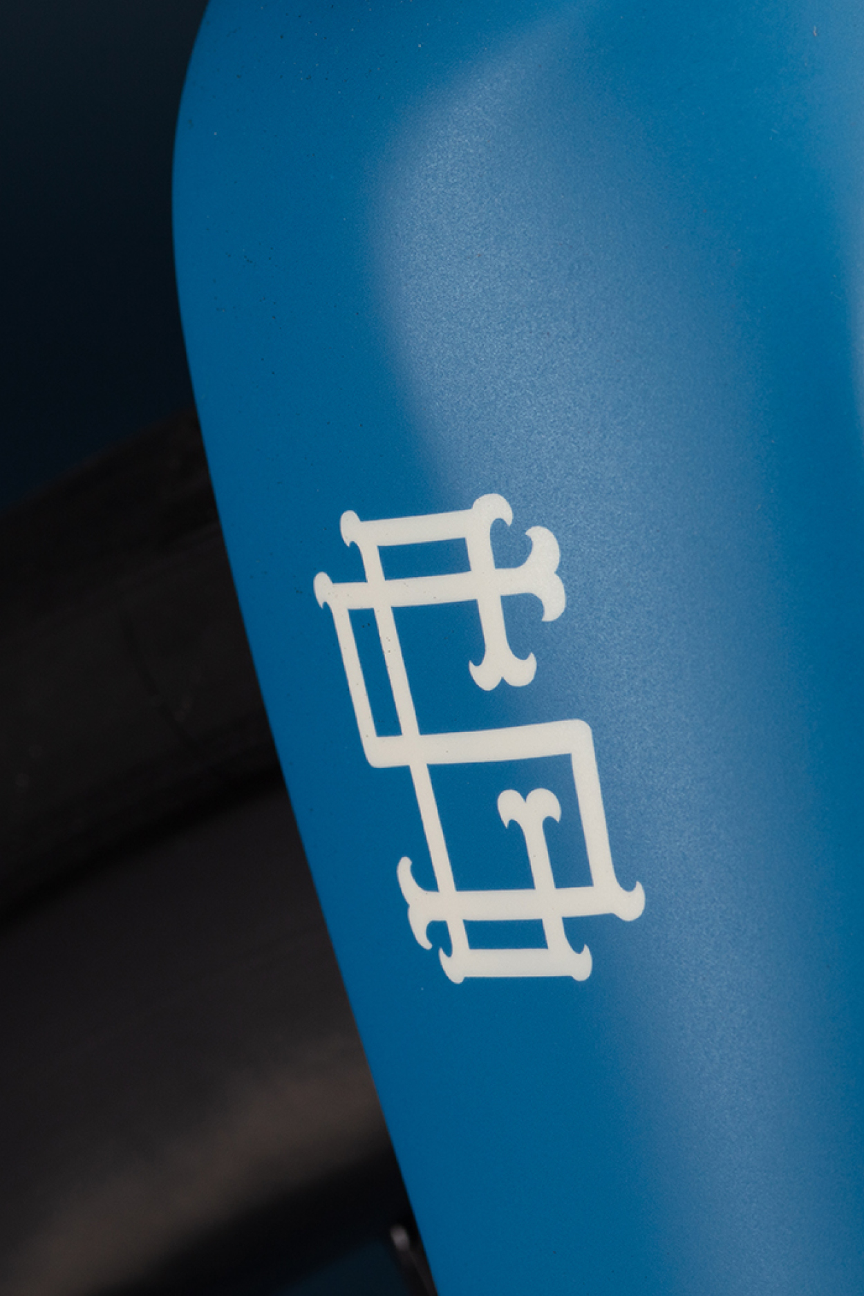
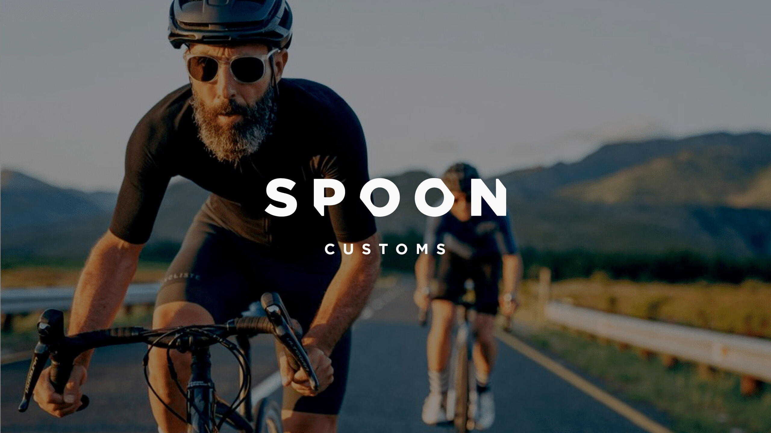
Our rationalisation of the visual identity started with the primary logo, which is a simple word marque, with selected characters chamfered at 38 degrees, referencing the Col d’Izoard incline (the birthplace of Spoon).
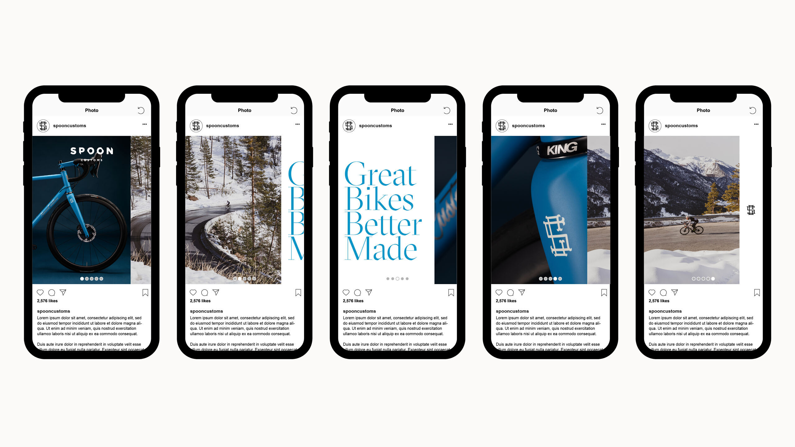
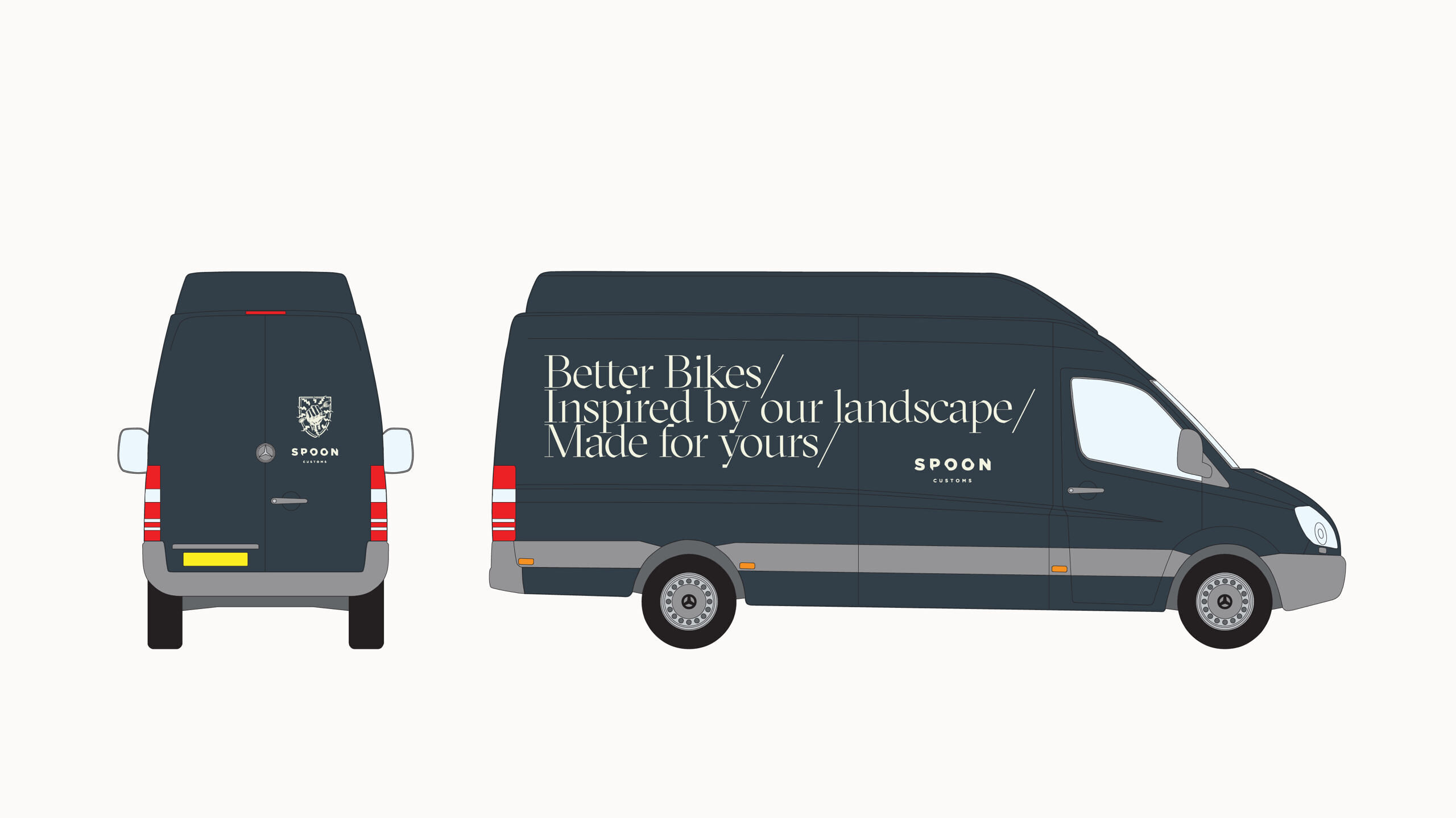
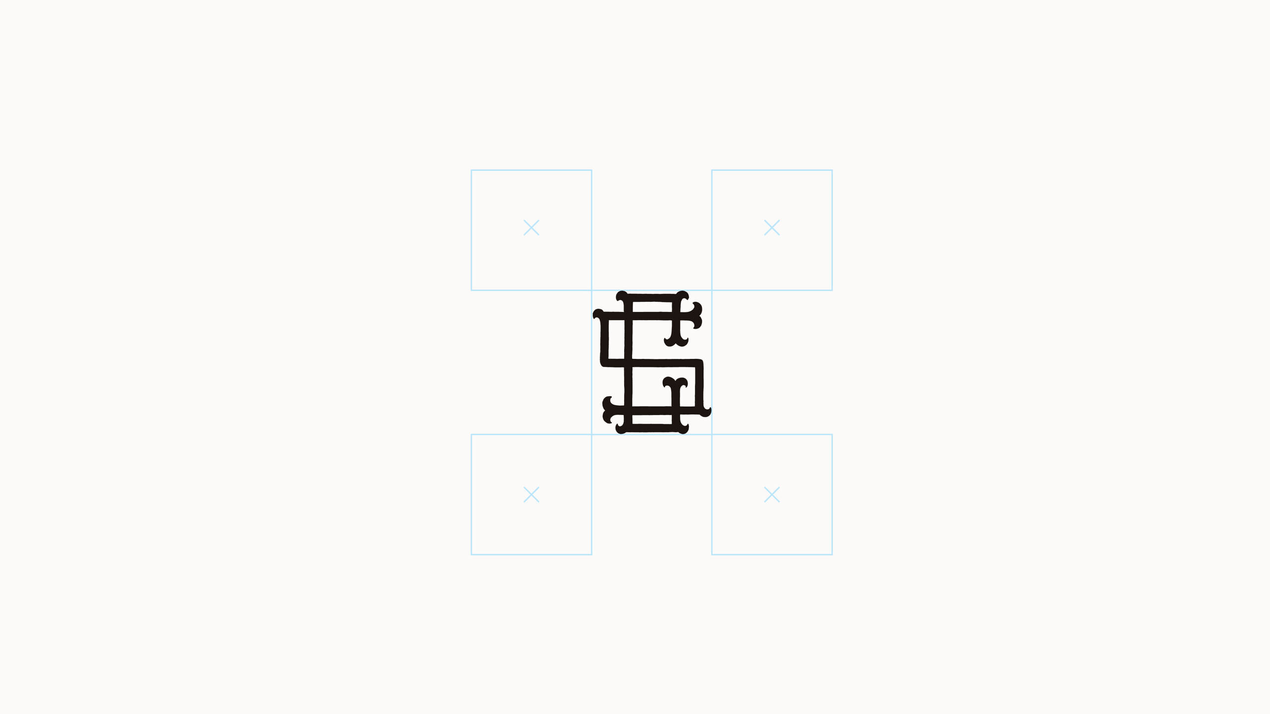
Bellow this sat a collection of hand crafted logos and marques that we assigned specific roles within the brand hierarchy. The myriad of supporting fonts and colours were stripped back to 2 brand fonts and a paired-back colour palette creating consistency across all touch points.
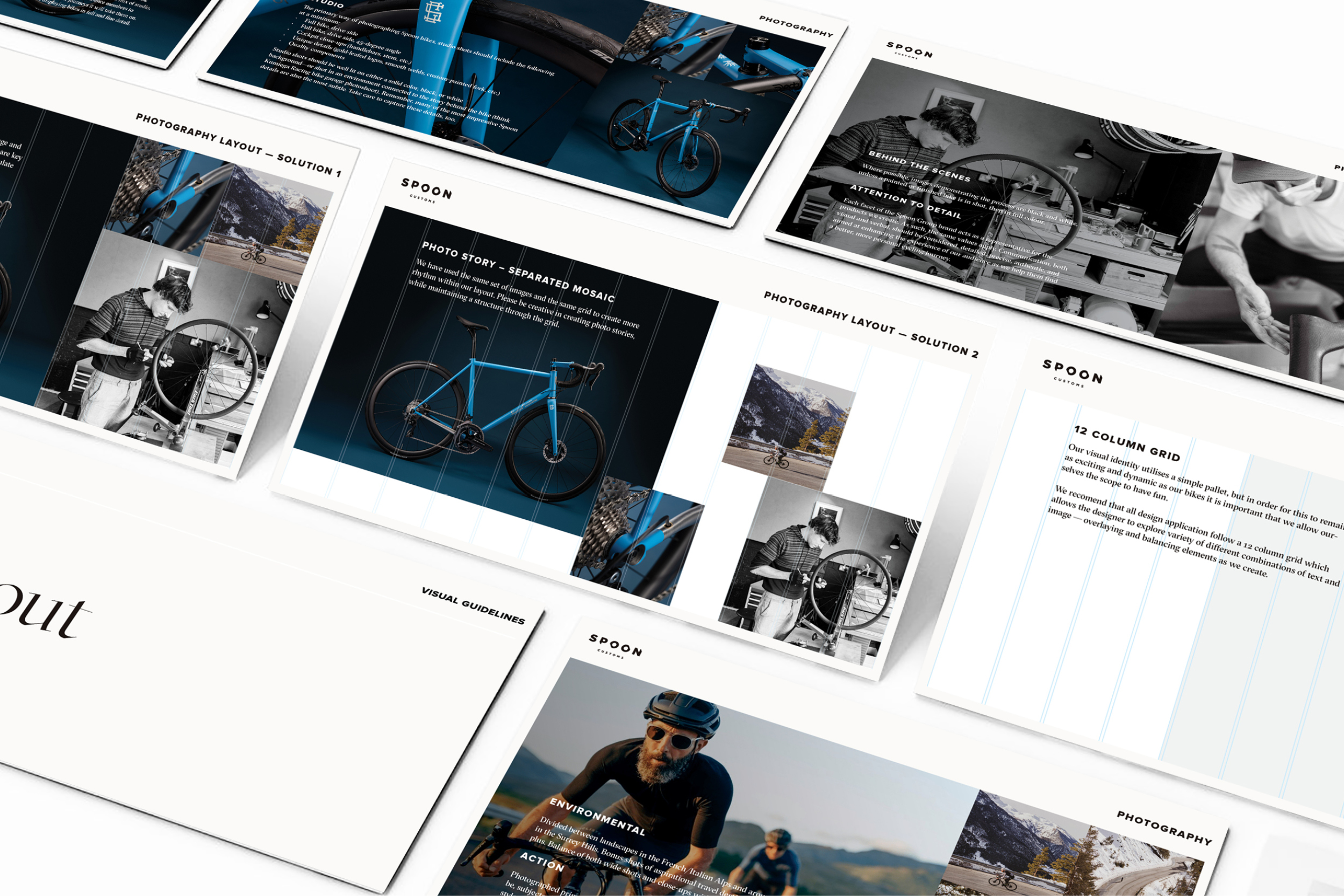
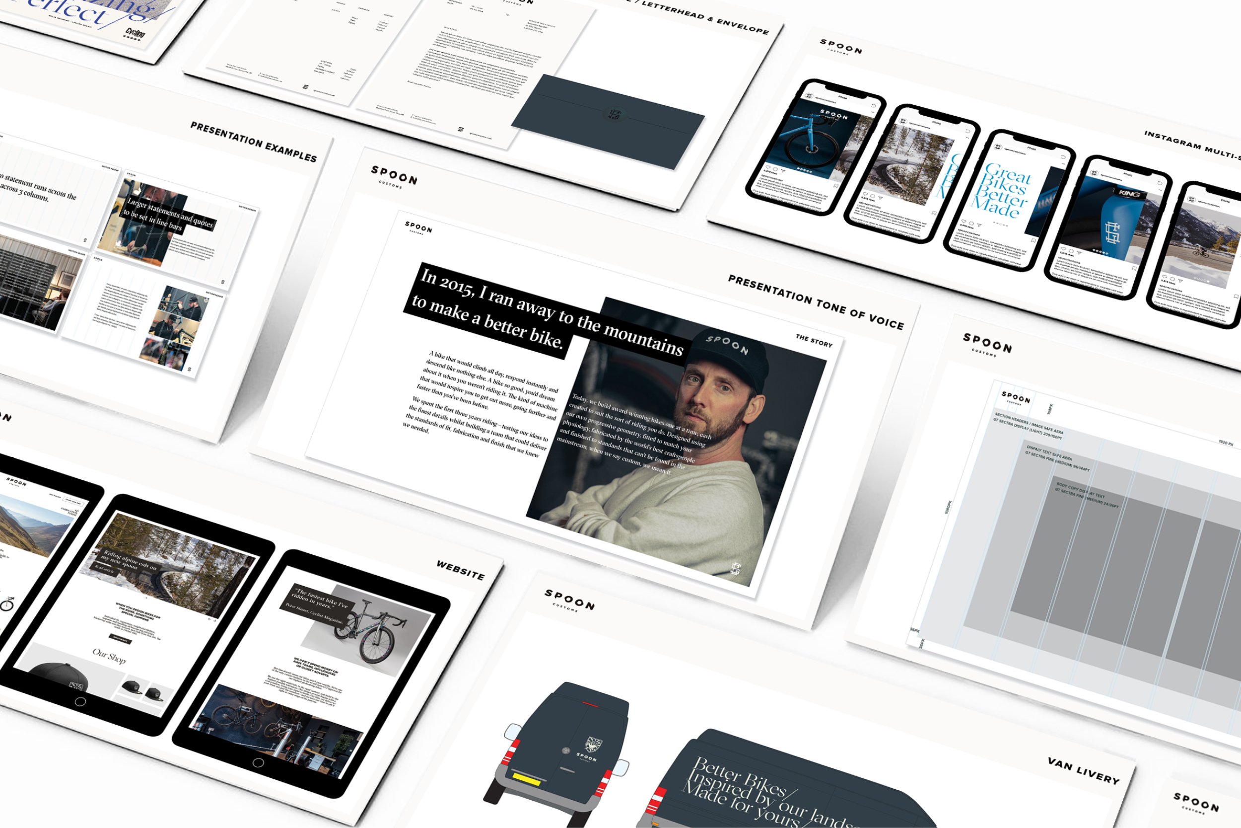
Rules of application were set to a simple grid, with text and photography co-existing with the eclectic mix of logos. This allowed the brand to retain it’s unique charm, while presenting as a grown-up brand where ever it showed up.