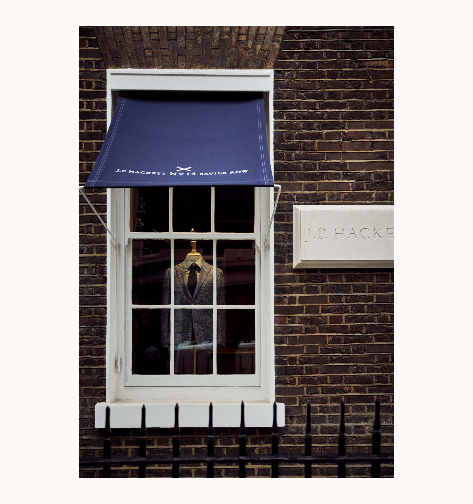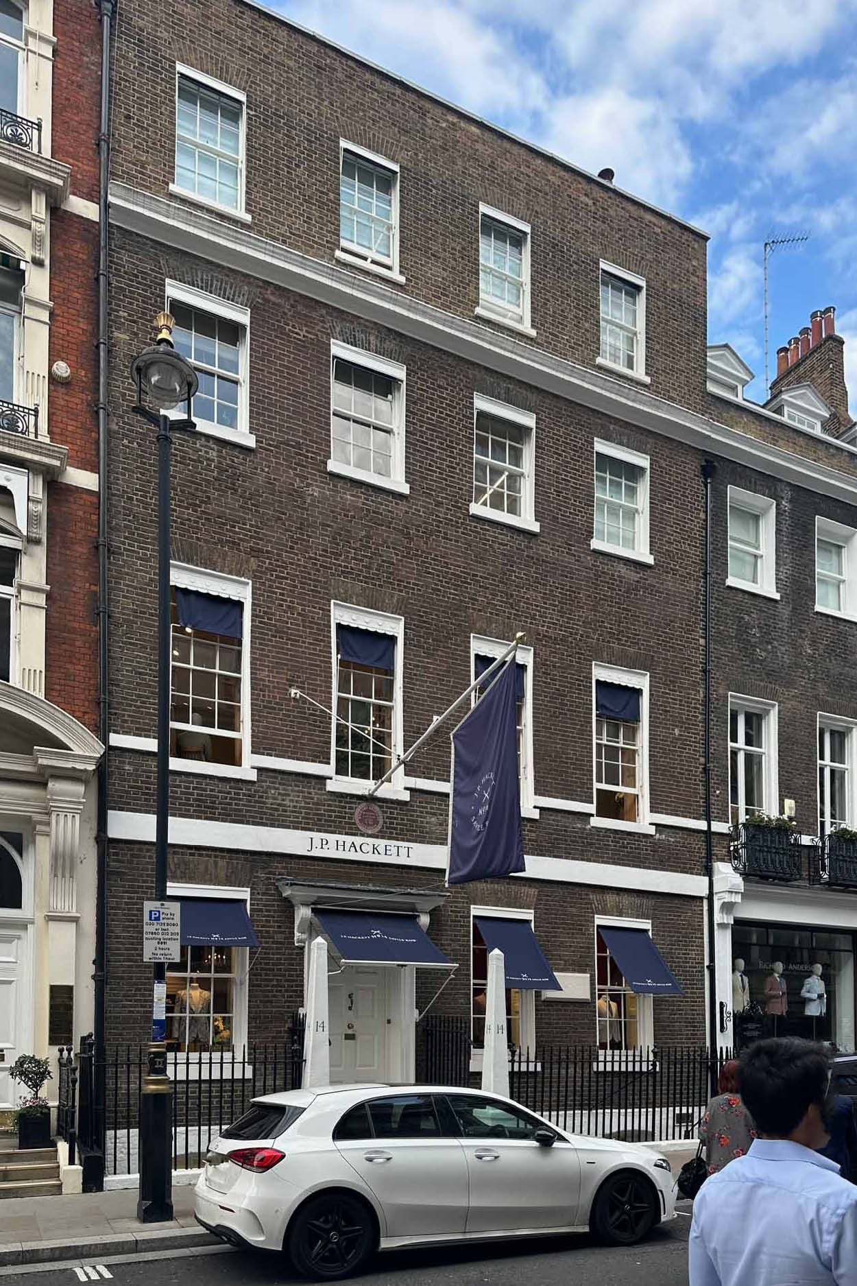
Hackett approached ABD to create a visual identity for their new top tier brand, to be inspired by their new flagship home of No. 14 Savile Row. This address had previously been home to Hardy Amies and is considered to be the most desirable address on the Row.
The brief would be to develop a brand identity which addresses a dual product offering — bespoke tailoring and ready-to-wear. The identity would need to adapt to both worlds, an identity which on one hand can be built around a single address (bespoke tailoring) and modified to be a globally distributed luxury brand.
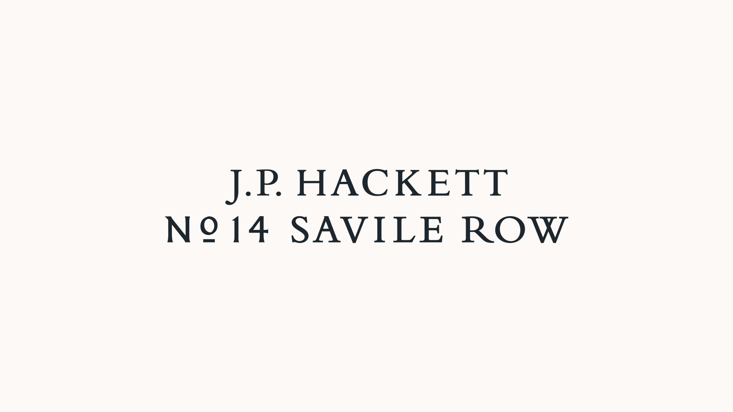
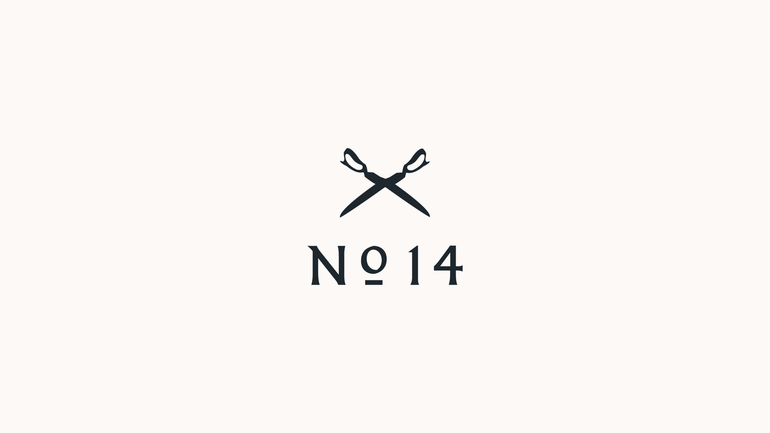
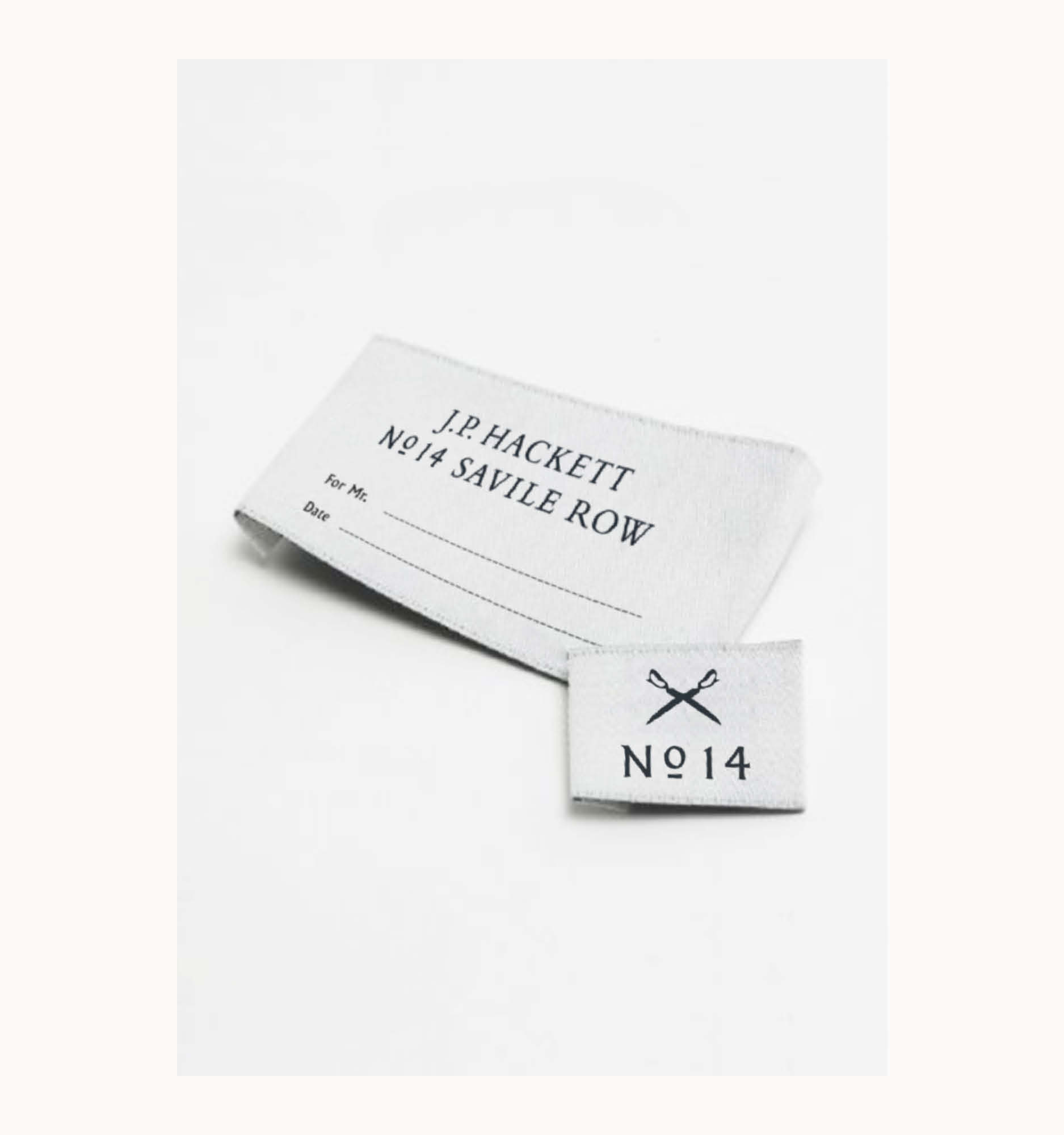
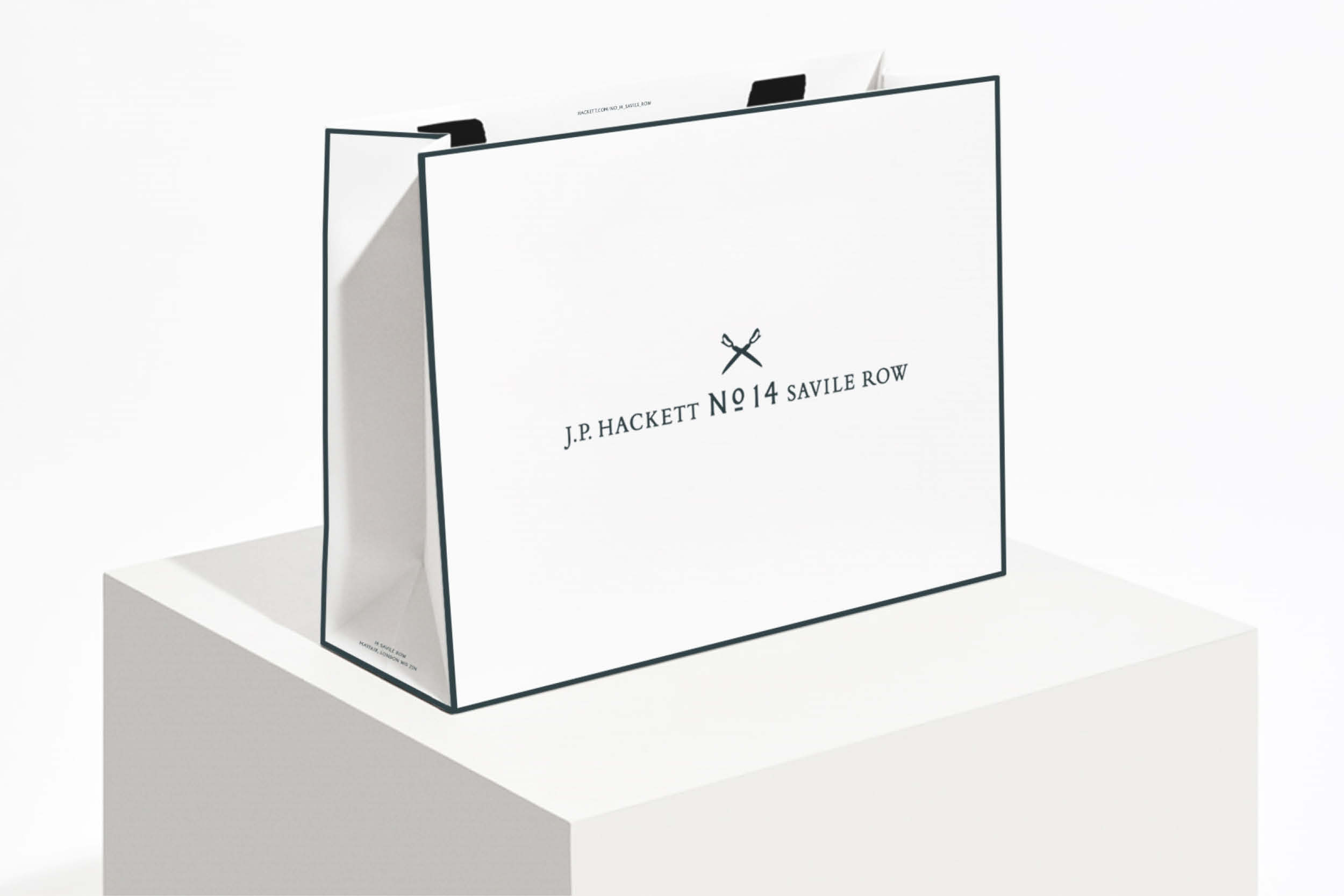
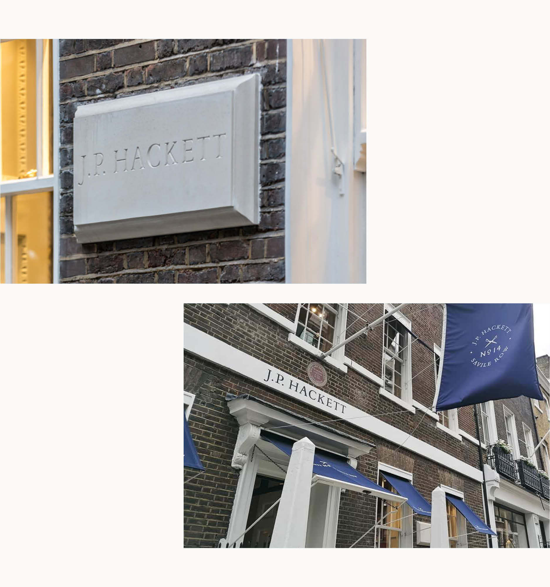
No. 14 Savile Row is a very special address for the brand to be inheriting. It is the most original example of Burlingtonesque architecture on the Row and so we chose to take inspiration from this. The entrance is flanked by two Obelisks which feature the No. 14, set in a chamfered, engraver’s font. This informed the typographic styling for the central element of the identity – the numeral, No. 14.
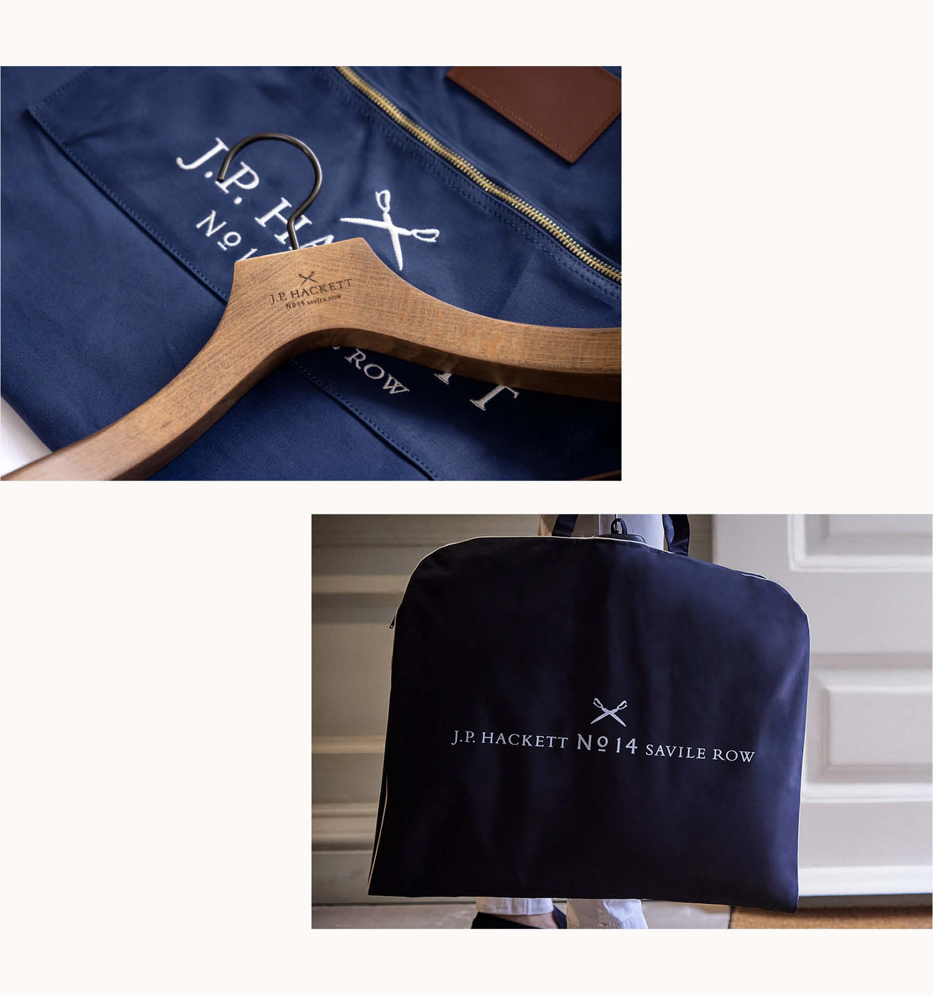
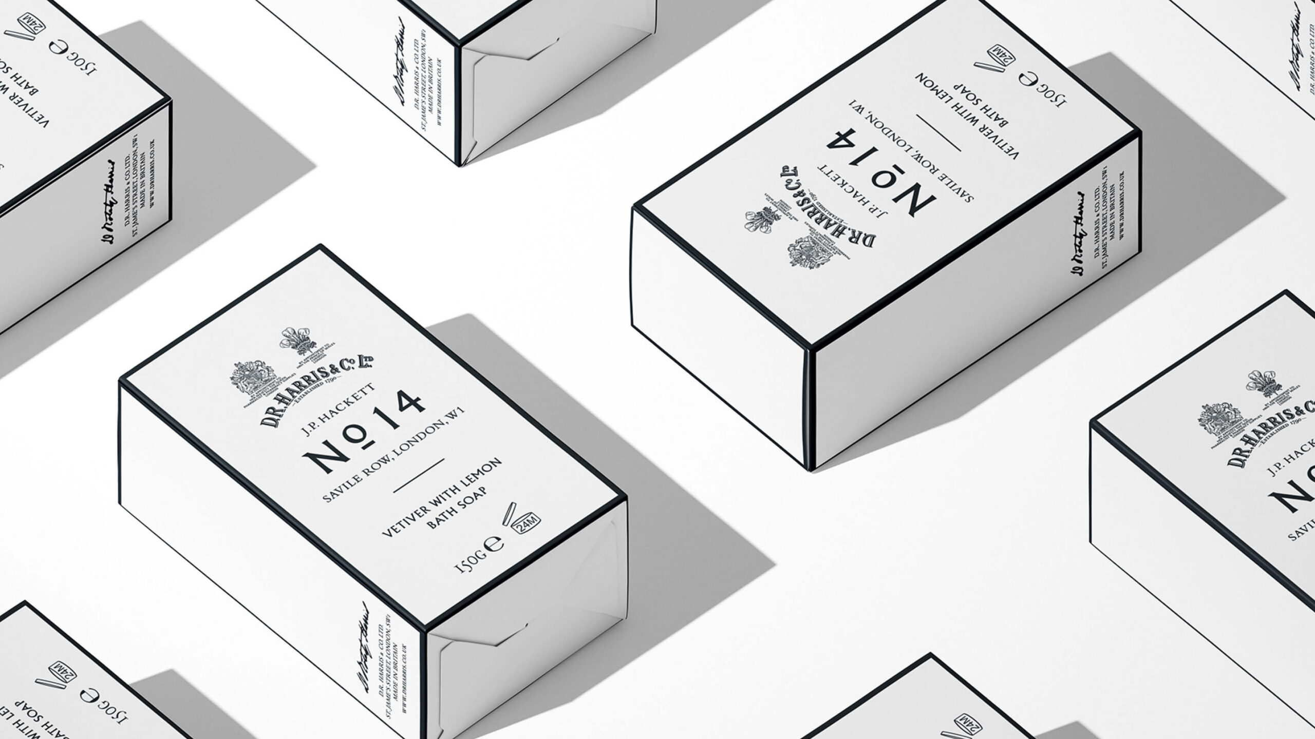
As we set about organising the hierarchy of brand information around the numeral, the first thing to address was how we adapt the Hackett master brand to accommodate a more personal address. J.P. Hackett was adopted, which placed Jeremy Hackett front and centre, giving the brand greater authenticity and No.14 Savile Row, the proprietor it deserves.
We adapted 3 different versions, reconfiguring the information while retaining the ratio of scale throughout. The result is an understated, elegant system that accommodates a variety of applications and exists in harmony with the originality of the newly restored building.