Elisa Furci has Italian food in her blood, spending her formative years helping her mother (an Italian New Yorker) run the family restaurant in Brighton. This lead to a career running various restaurants in the burgeoning London restaurant scene.
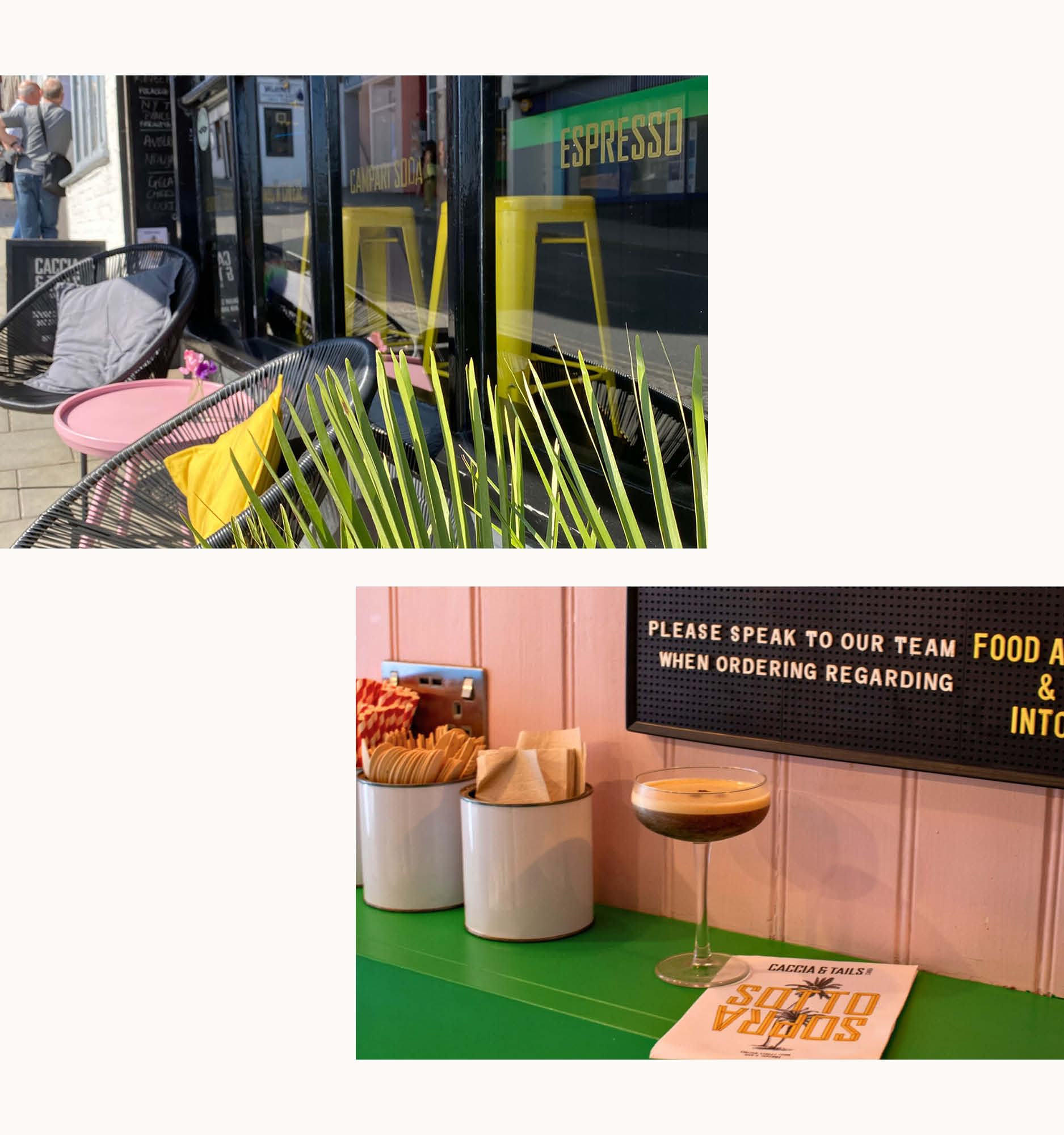
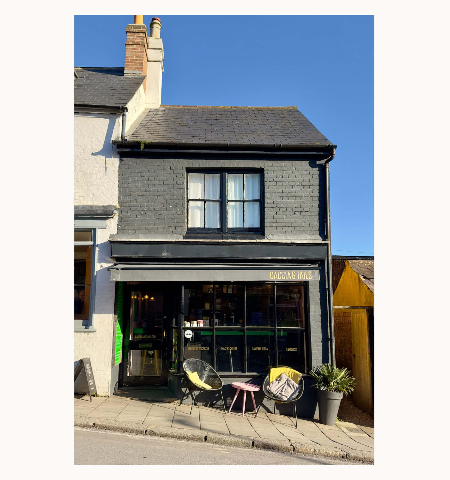
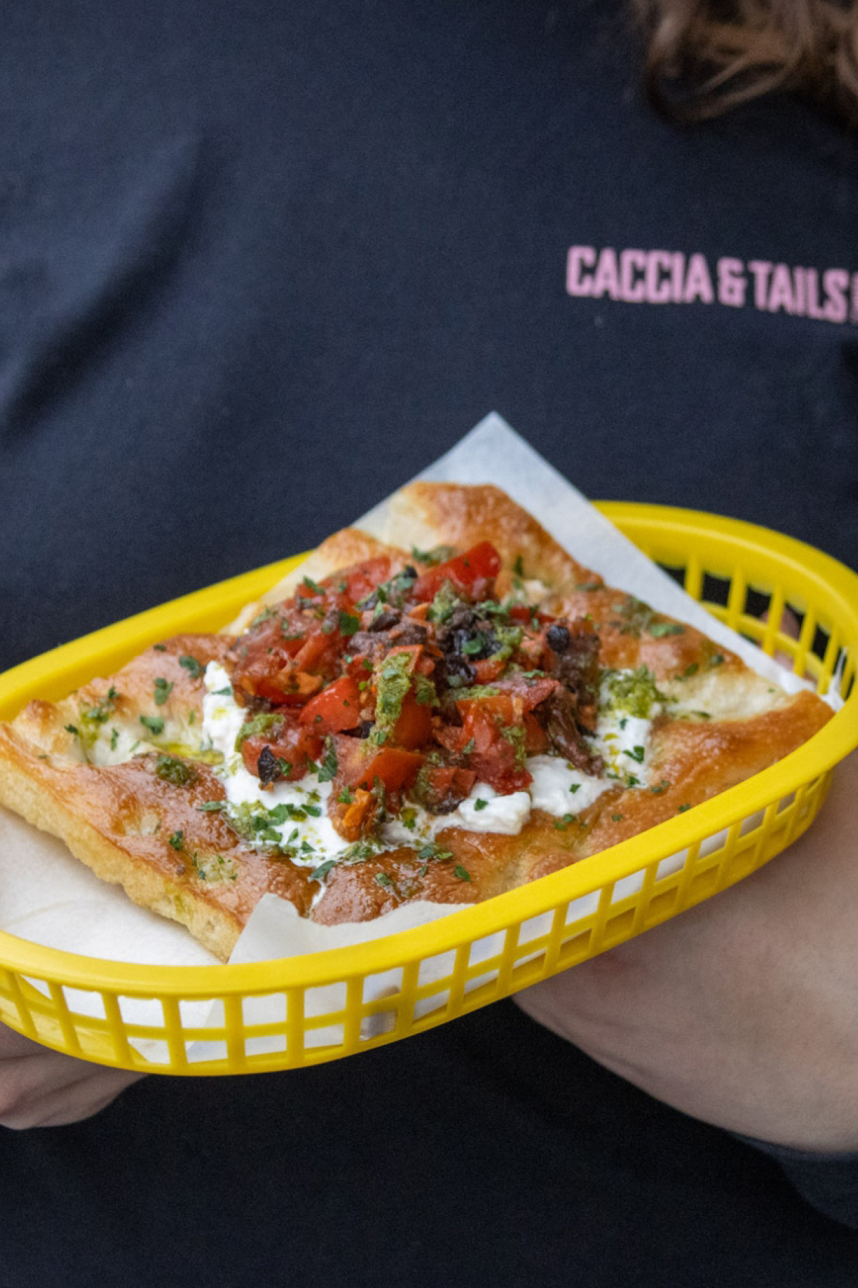
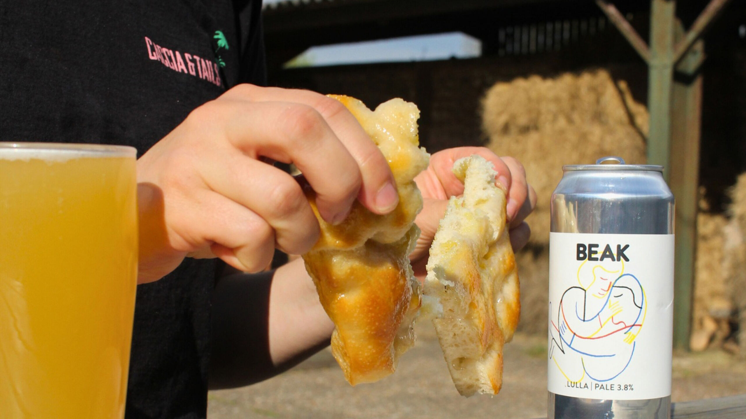
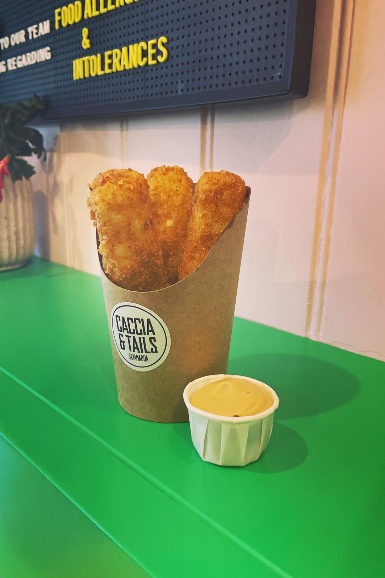
Elisa’s concept for her own restaurant follows the classic Sciamadda tradition of serving freshly made food to be eaten at the counter or on the go. The speciality for the concept, being Genovese Focaccia and simple Italian cocktails, hence the name ‘Caccia & Tails’.
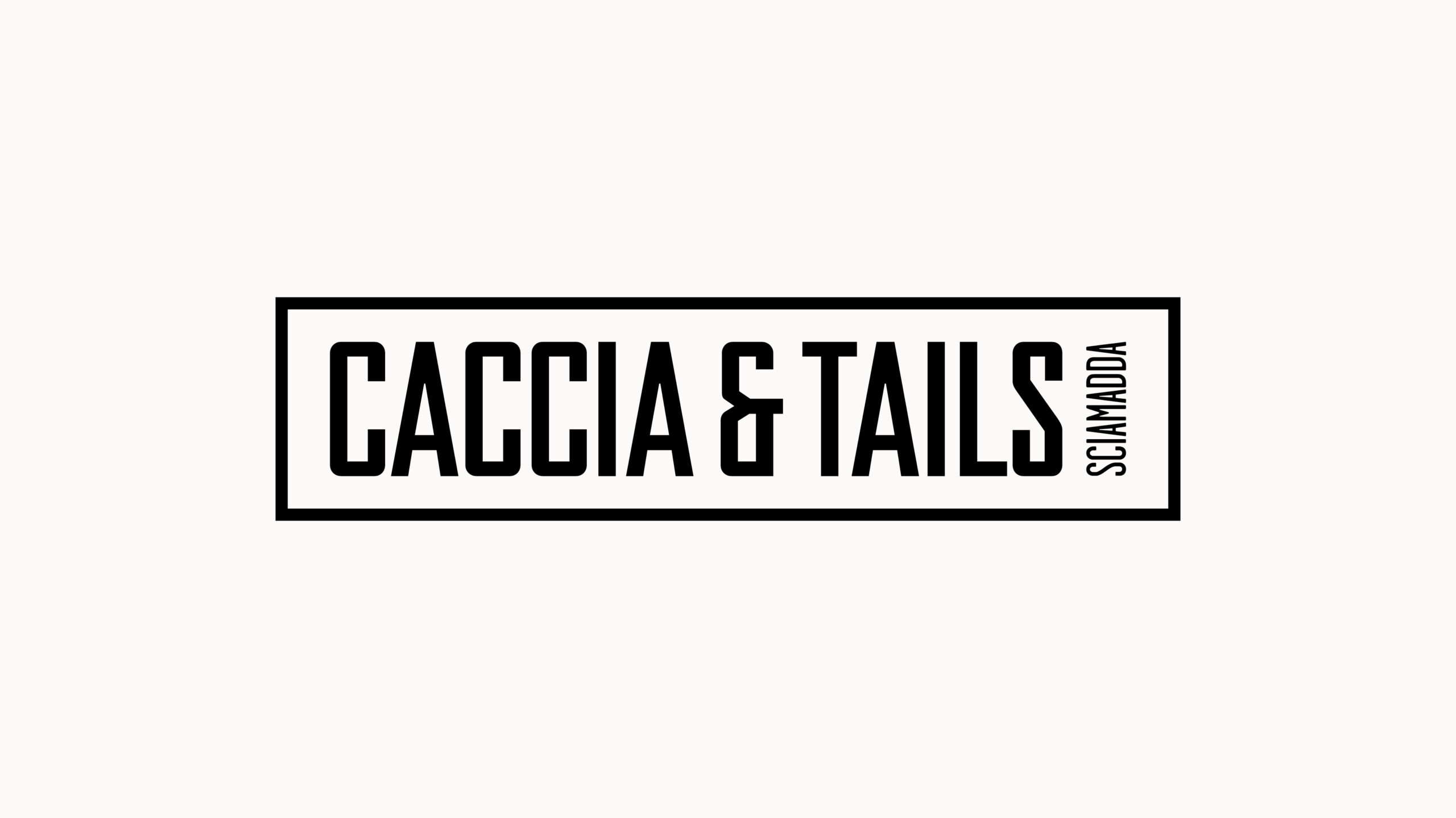
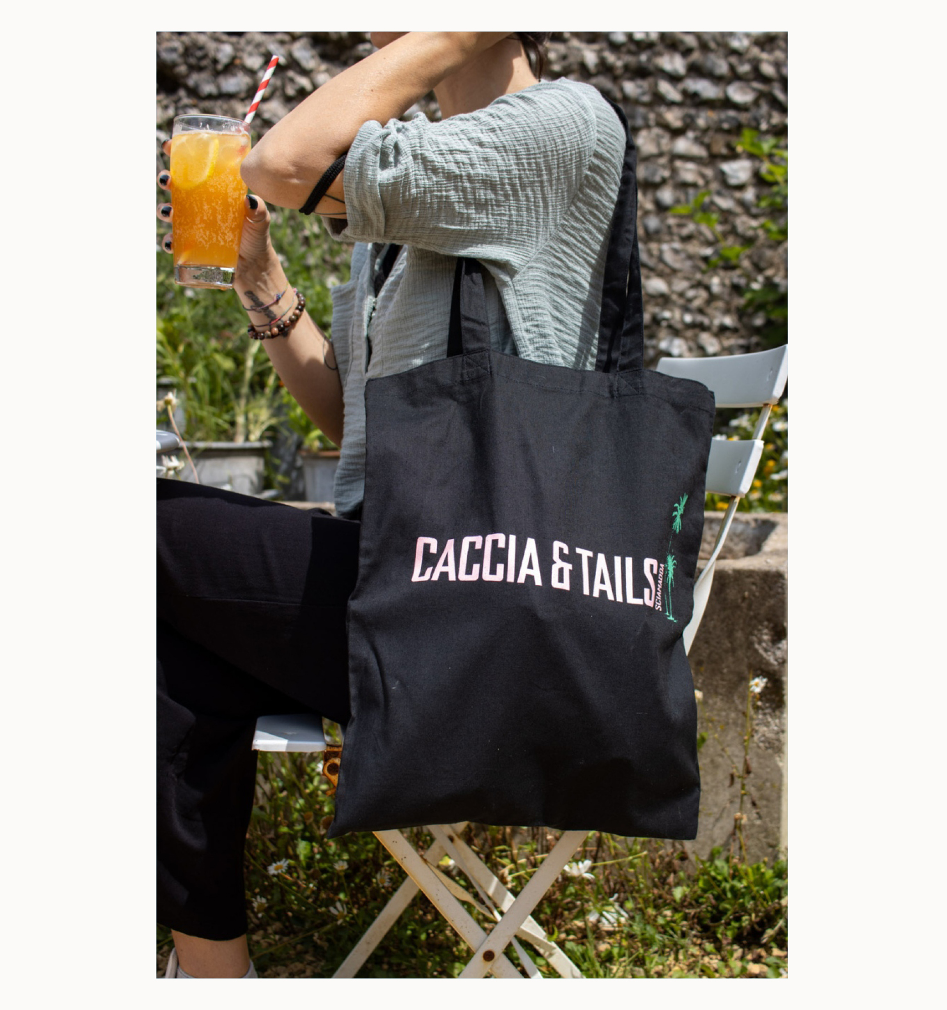
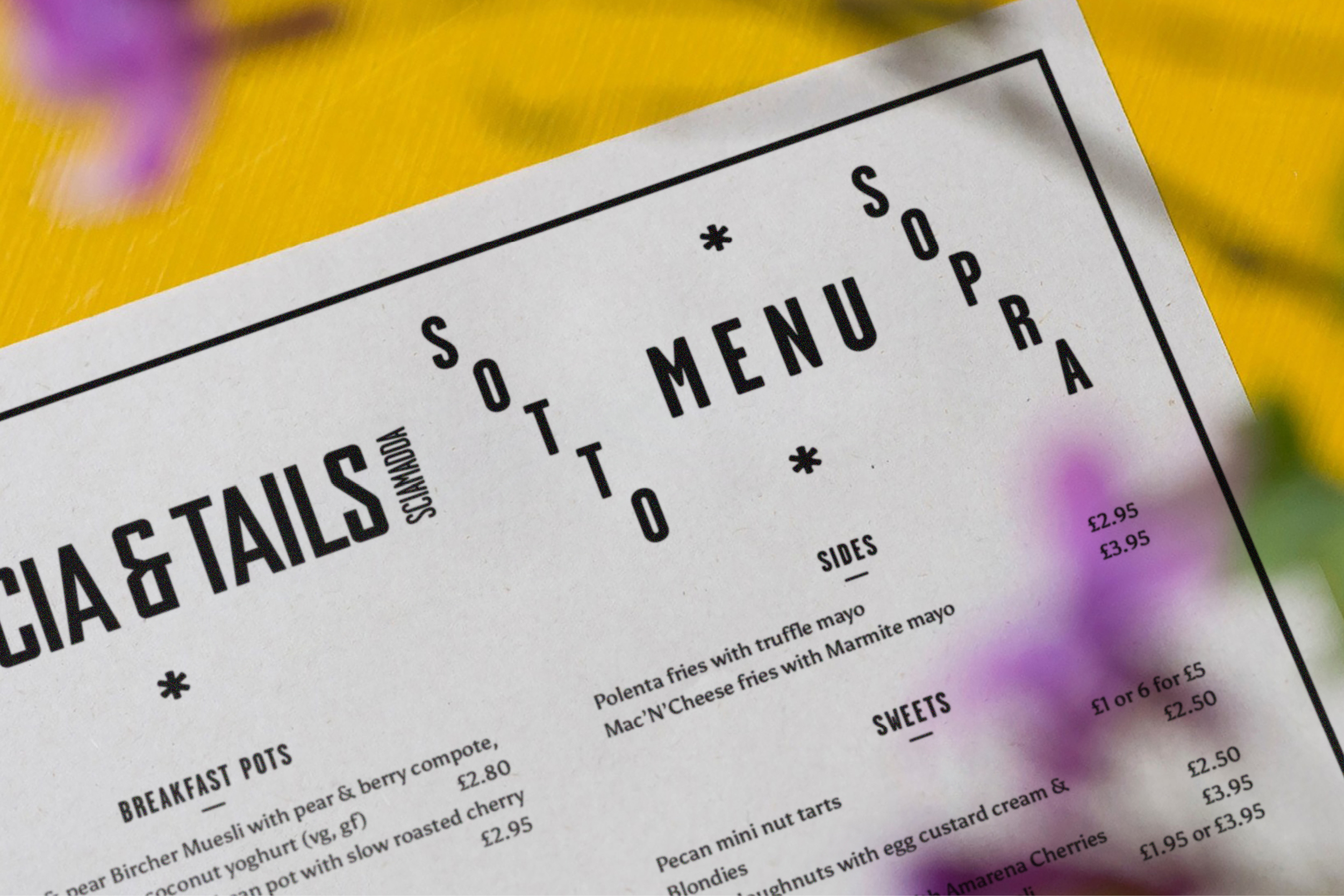
Our investigation of the traditional Sciamadda lead us to discover a beautiful array of classic sign writing and Italian typography which informed our choice of brand font, a distinctive Condensed Gothic.
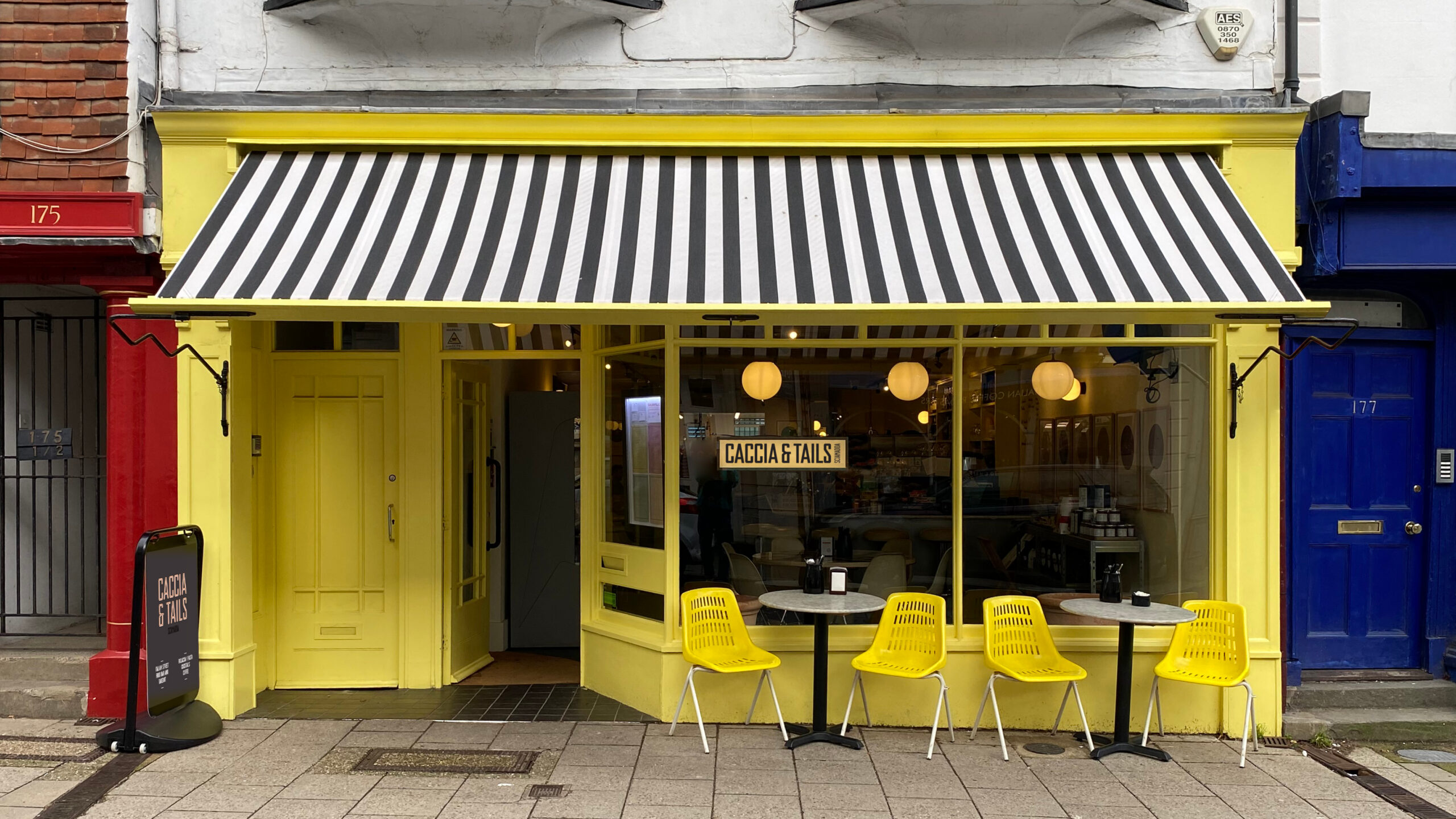
We developed this to form a bespoke engravers display font which we evolved across 3 different weights, designed to form a multi-layered type system. This system utilises our sorbet colour pallet, inspired by the dusty pink and burnt ochre houses of the Genovese old town.
From Caccia & Tails humble launch on Station Road in Lewes back in 2018, the restaurant has now expanded across sites at Charlston House, Brighton Picture House, The Pavillion Chichester and most recently to Lewes High Street. The visual identity has maintained a strong presence throughout all locations, giving Caccia & Tails a recognisable presence across East and West Sussex. Next stop, London?